Nicalis Update

By: Derek Yu

On: January 23rd, 2009

Cave Story Wii

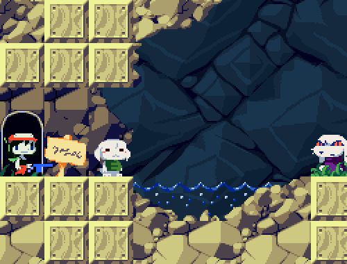
Nicalis has updated their website. I like this new screenshot, posted on the blog, which shows off a lot of the new high-resolution sprites, including a close-up portrait of Toroko (the image above is cropped and blown up). It looks very cohesive.

  • Adamski

    Those blocks just seem to stand out against the rock tiles to me >_<

  • Lyx

    Indeed, and i think its because of the highlight color. But besides of that, i like it.

  • http://0xdeadc0de.org/ Eclipse

    dunno, this screenshot looks so ugly for me.
    The blocks seems made of wood instead of stone, Quote looks like an emo and the polar star is only a stupid blue stick… Toroko looks not cute at all too :

    point up for the background which is a nice version of the original very tiling one

  • TakaM

    :cavestory:

  • Adamski

    This is such a CS clone.

  • durp

    welcome to 11 days ago

  • Kvalsternacka

    Think it looks pretty good. Love that blue background.

  • http://pitapumpkin.blogspot.com Pita

    I like it a lot. Only, I like it a lot better how Derek has cropped it and blown it up.

    Another unforeseen problem of increasing the resolution I guess. It feels like there’s too much space and not enough to look at. At x2 with a smaller screen it looks delicious.

    Either way, this is still a lot better than the previous screens. It will be good, I think. :)

  • Secret Admirer

    TIGsource more like SLOWsource

    (just kidding, I love you j_j)

  • Pigbuster

    I don’t know if I’m just missing it, but there doesn’t seem to be a link from the main page to the blog.
    Which is silly.

  • YuRiPa

    Meh. I’m sticking with the old graphicsm no need to fix what isn’t broken.

    Also sue looks horrible and has a coin-slot in her forehead.

  • renkin

    Much larger single colored fields make it look very cartoonish, and Toroko (I don’t think it’s Sue) looks horrible. The main guy and King look pretty good, though.

  • PoV

    I like it. True to the original (heh… given a certain someone is working on it and all).

  • what

    OMG! CAVE STORY RIPOFF!!!!!!!

  • squish

    Yeah… torroko looks bad but i’ve seen another shot of her and the eyes looked better, i think she’s in mid animation.

  • king

    I think it looks pretty good.

  • Jamey

    Please stop with the Cave Story ripoff jokes. They haven’t been funny for a long time. It’s just annoying now, not ironic or surprising, to see it posted here. Especially twice (wtf?). Thanks for sharing your hilarious and creative wit, guys.

    Anyway…

    I think the new art looks pretty good. I’ll probably play it in the new and old graphic styles until I decide which I like better. I’m sure Pixel isn’t going to screw up his labor of love. I am wary, however, of the music. I know the available videos had bad audio in general, but I feel like synthy music that doesn’t exactly try to emulate 16-bit chips will sound jarring against SNES-style graphics.

  • Foppy

    I have never played Cavestory but I like the Cavestory joke. Jokes like that can’t get old… the whole idea is that they are made over and over again.

  • http://www.idlethumbs.net Jake

    Weird that Nicalis’ updated website doesn’t actually include a clear link to their blog. Weird oversight.

  • Fuzz

    I don’t have a Wii, but if I did, I would definitely be sticking with the old graphics. The detail really seems to detract from the game. I really liked the original art style, and a lot of that was because it left the details to the imagination of the player. For example, I used to think that Quote’s antenna was his hair, and I thought that his hair was green. I like being able to come to my own conclusions about what a character looks like, rather than being given all the details. I also think that the new art is really ugly in general.

  • FishyBoy

    But if you beat the game, the credits pictures would sorta ruin your illusion anyways!

    Speaking of which, it would be awesome if the ending credits pictures also got a high-res update.

    Anyways, if you don’t like it, play it with original graphics. It’s not like they’ll stop you from getting whatever other new content there is just because you don’t like the new graphics.

  • Scott

    underside ripoff

  • BeamSplashX

    Cave Story for Wii gameoff.

    But yeah, I liked the old style better only because I’m partial to small graphics. These do look kinda strange, though. Not really BAD, just strange. Quote’s rounded rectangular head seems out of place when the rest of him is curved so normally.

  • DaVince

    Jamey: actually, posting that “unfunny joke” here DOES make it funny.

  • Jamey

    Oh, sorry DaVince, I must have been mistaken! And Scott, I did chuckle at your comment.

  • Cave Story Ripoff Joke

    You think I’m funny? Funny how? Funny ha-ha or funny peculiar? Am I a clown? Am I here to amuse you? Am I? AM I?

  • http://www.distractionware.com Terry

    Haha! I get it! Because it *is* Cave Story, right? So calling it a Cave Story rip-off is ridiculous!

    You guys are hilarious!

  • Kenzya

    Not only that but to repeat it over and over and over through out the comments is hilarious. Not to mention just throwing in different games which is a completely new and revolutionary idea. Hey is that a Fifa 09 ripoff

  • X_Sheep

    I already predicted someone would say ‘underside ripoff’. In fact if it wasn’t done already I would’ve done it myself. >__>

  • http://teknopants.com Teknogames

    Gotta say I like the old graphics better. The tiles are less obvious in the old ones, and the characters are cuter.

  • alspal

    It’s an interesting enlarged style, but the natural style seems much more natural.

  • eobet

    Oh, they finally cleaned up the background graphics. Their website used to feature what looked like horribly upscaled tiles. They still need to fix some tile transitions, though, but it’s looking good!

  • Quetz

    I am in general agreement with the general consensus on the general graphical changes made.

  • I Like Cake

    You know what? I don’t get it.

    Cave Story was fun, but it was no triumph of modern art. The original graphics looked fine and the new graphics also look fine.

  • anonymous

    Toroko the Magnificent Mongoloid.

  • Huzzah

    wheres my underside remake

  • http://www.adamatomic.com/ Adam Atomic

    This was the first tileset I did – I think it turned out OK but the rest turned out MUCH better I promise! You guys will dig it for serious :)

  • Chris L

    Its really just that people have developed such nostalgic fondness for the old graphics (which were great, admittedly) that its only natural for the new graphics not to hold up.

    Its much easier to scrutinize the graphics in these still frames. I’m sure in actual gameplay the difference is negligible at worst and maybe even an improvement in readability at best (it is meant for HD screens after all).

  • I Like Cake

    You know what it is?

    You know how everyone has that one friend they’ve known for a long time who’s constantly bringing up things from years ago? So every time he opens his mouth it’s “Hey man, remember when we were in high school and we used to go down to the cafeteria and complain about the food every lunch hour? Wasn’t that great?” Even when the actual anecdote was pretty mundane at the time, the fact that it is in the past makes it, for this guy, some Proustian pinnacle of happiness and contentment which has been lost and can never be regained.

    On the internet, you are surrounded by that guy. Everyone is living in the past and it’s fucking depressing.

  • cactus

    I think the new graphics makes it look too space-y. I mean, there’s too much empty space in between a lot of things. And the tiling “errors” aren’t very nice.

  • cactus

    I’d totally buy this if I had a Wii though.

  • http://www.boogatech.com Markham

    There was a rather interesting comparison pic in the comments of the linked article:

    http://i41.tinypic.com/16a8rwy.gif

    It really doesn’t look all that different. Quote does feel different with the addition of a visible mouth, though. At it’s current width, it kinda looks like he’s smirking. Maybe it’s just me, but it seems like I can be more free to imagine a character’s emotions when I can’t see their emotions. Like Gordon Freeman in Half Life 2, for example. It really felt more immersing when the character’s reaction is left to your imagination.

    I hope the message boxes aren’t final. I really don’t like that font.

  • huh?

    You know what’s lame?
    Cave story rioff jokes

    You, know what’s ten billion times lamer?
    People who waste their time making negative comments on said jokes.

  • I Like Cake

    Wait, what does that say about people who waste their time making negative comments about people making negative comments about jokes?

  • stealthfire

    personally I liked the old art style better. in their effort to ‘improve’ all the sprites, they’ve inevitably changed the looks of some characters to a western style. eerie resemblance to sonic characters now.

  • Prio

    This comment thread is a cave story ripoff joke ripoff

    Also, it may be serious business

  • Pretzelking

    CAVE STORY RIPOFF HURR HURR

    You are all fucking retards and I Like Cake is right about everything he has said here.